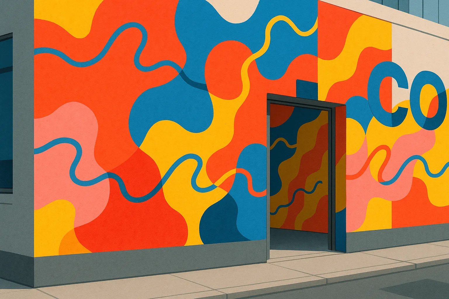
Chicago-based artist Emmy Star Brown brings a buoyant charge to the cityscape, composing murals from vibrant, amorphous shapes that collide with lively squiggles and the occasional touch of geometric lettering. She describes her studio practice as a place where her inner child comes to the fore, refining her language to the essentials of line, shape, and contrast. The result is a visual vocabulary that feels immediate and playful while remaining rigorously attuned to formal design.
Line, shape, contrast — and a background in communications
Brown’s approach pares expression down to fundamentals. Lines ripple and curl, shapes swell and taper, and contrasts snap into focus, making each surface a study in rhythm and balance. Her large-scale installations on urban buildings draw on a background in visual communications and advertising, knowledge that clearly informs how she orchestrates attention across a wall and sustains momentum from one color field to the next. The murals extend across both interior and exterior settings, where walls become animated with saturated hues and brisk gestures that move uninterrupted across the architecture.
That sense of play is grounded in discipline: by emphasizing core elements, Brown channels the immediacy of drawing into expansive, environmental compositions. Squiggles thread through broad, organic forms; letter-like geometry punctuates the flow without overwhelming it. The interplay gives the work a graphic clarity that speaks to her design roots while keeping the mood open, exploratory, and accessible.
On view: The Peace of Wild Things
Brown’s work is currently on view alongside that of Danym Kwon in The Peace of Wild Things at Joy Machine. The pairing situates her murals within a curated context, offering a chance to encounter the full sweep of her color and line in dialogue with another artist’s perspective. For those interested in following along with new projects and installations, the artist continues to share updates on Instagram.
Across studios, interiors, and urban facades, Brown’s practice maintains a consistent clarity of purpose: to let line, shape, and contrast carry the feeling. The language is simple; the experience is anything but.